Typography & Fonts

Typography & Fonts
Consistent use of typography helps build visual familiarity with our brand and ensures that Saint Mary’s College materials have a cohesive look. Our selection of typefaces bring a diverse set of characteristics that work together across the full range of SMC communications.
- Primary Display Typeface: Arpona
- Primary Sans Serif Typeface: Avenir
- Primary Serif Typeface: Bagatela
- Typography overlay
Primary Display Typeface
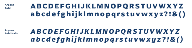
Arpona is a typeface with small wedge serifs and a strong character. It pairs well with our SMC spirit mark. We suggest using it for short, impactful headlines and subheads in semibold or bold weights.
Arpona can be used with an Adobe license on Adobe Fonts.
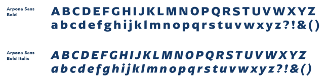
While Arpona should remain the primary display typeface, Arpona Sans may be used occasionally. Arpona Sans is in the same font family as Arpona, but a slightly simpler typeface as it does not have serifs. Arpona Sans can be used for longer subheads or callouts. Arpona Sans can be used with an Adobe license on Adobe Fonts.
Capitalization
When used for headlines or titles, Arpona should be used in title or sentence case, never all caps. Arpona in all caps should be reserved for typography in a circular shape.
Letter Spacing
For maximum legibility, Arpona should be used with tracking set at 25 (in thousandths of an em).
Primary Display Typeface – Arpona
Primary Display Typeface – Arpona Sans
Primary Sans Serif Typeface
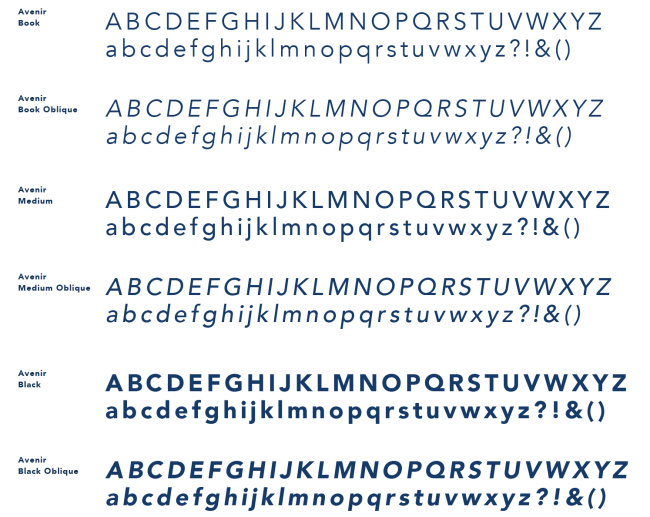
Avenir is a geometric sans serif typeface that pairs well with Arpona. Its clean, easy to read letter forms mean it works well for headlines, subheadlines, caption copy, and particularly body copy. Avenir comes in a variety of weights and works well in sentence case and all caps. Although Avenir is available in multiple weights, use should be limited to those versions shown here. Avenir is a system font that comes pre-loaded on Mac computers. If you are using a PC computer and do not have a font license, the system font Arial should be used instead.
Primary Sans Serif Typeface – Avenir
Primary Serif Typeface
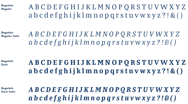
Bagatela is a classic-looking serif typeface that comes in a variety of weights with complementary italicized versions. Intended uses include: accents in logos and headlines, subheads, and pull quotes.
Italics should be used for typographic accent only. Liberal use of italics can affect the intended tone of the message and alter the overall legibility of the text.
Bagatela can be used with an Adobe license on Adobe Fonts.
Primary Serif Typeface – Bagatela
Typography overlay
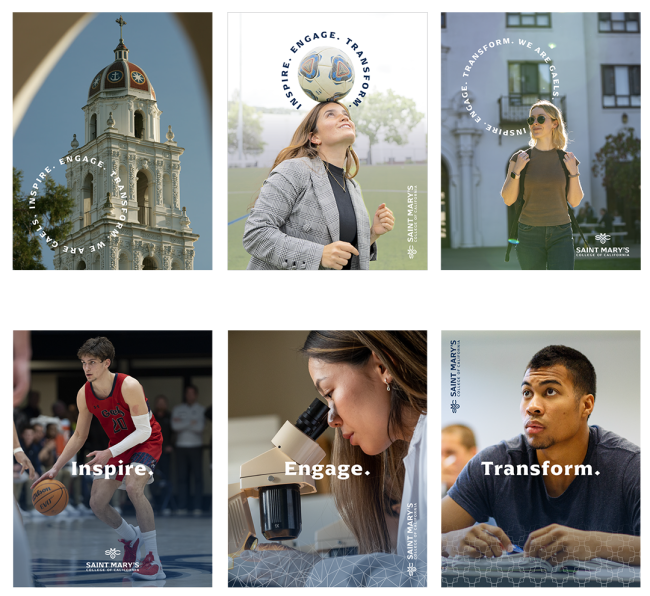
Our commitment to inclusivity and connection is reiterated through use of circular shapes and typography wrapped into a circle. This further reinforces the importance of belonging and interconnectedness, reflecting our vibrant and diverse community. Type can also be used in a more traditional horizontal orientation. In both instances, typography should not compete with the image. Instead when layering content over an image, take care to place it in an area of the photo free from distracting activity. Look for photos with relatively clear space for text. Also select a text color that provides maximum legibility.
Office of Marketing and Communications
Office of Marketing and Communications
Email: marcom@stmarys-ca.edu